Add Error Bars to Charts – Excel & Google Sheets
This tutorial demonstrates how to add error bars to charts in Excel and Google Sheets.
Add Error Bars to Charts – Excel
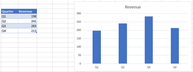
We will add error bars to the chart below.
- Click on the + Sign in the top right of the graph
- Select the arrow next to Error Bars
- Select what type of error bars to create (see below for descriptions)
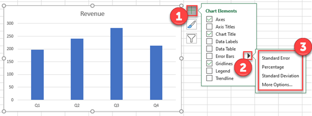
Standard Error – Shows the standard error of the mean (average) for all values
Percentage – Adds error bars based on a percentage (default = 5%)
Standard Deviation – Shows error bars based on the number of standard deviations (default = 1) away from the average.
More Options – Customize Error Bars
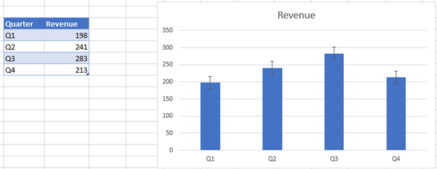
Final Graph with Error Bars
After applying the error bars, your charts will look like this:
Add Error Bars to Charts – Google Sheets
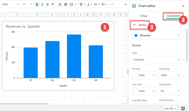
Using the same data as above, we will add error bars to a chart in Google Sheets:
- Double click graph
- Select Customize
- Click Series
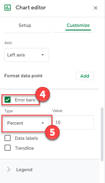
4. Select Error Bars
5. Customize how you would like under Type
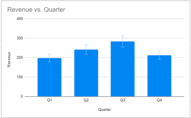
And the final graph with error bars will look something like this:
