How to Create an Arrow Chart – Excel
This tutorial will demonstrate how to create an Arrow Chart in Excel.
How to Create an Arrow Chart – Excel
We’ll start with a dataset that shows the number of items sold in the last two years.
![]()
Blank Column
First, create a column titled “Blank” and calculate the Minimum value with the MIN Function:
=MIN(Year 1, Year 2)
![]()
Decrease Column
Next, we’ll add a “Decrease” column with a MAX formula:
=MAX(0,Year 1-Year 2)
![]()
Increase Column
Next, we’ll add an “Increase” column with formula:
=MAX(0,Year 2-Year 1)
![]()
Create a Graph
Highlight the Item Column and then press CTRL while highlighting the other three columns as shown below.
![]()
- After highlighting the columns, select Insert
- Select Bar Graph
- Select the Stacked Bar Graph
![]()
The graph will look similar to the one below.
![]()
4. Right click on the Y Axis
5. Select Format Axis
![]()
6. Select Graph Icon
7. Check Categories in reverse order
![]()
Update Graph
- Click on Blank Bars
- Select Format
- Click Shape Fill
- Change to No Fill
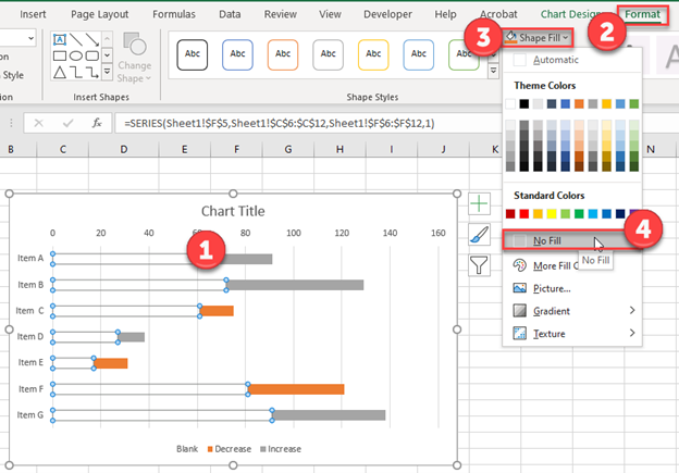
Your graph should look similar to the one below.
![]()
Adding Arrows
- Click Insert
- Select Shapes
- Click Arrow: Right and drag is somewhere on the workbook. Then do the same for Arrow: Left.
![]()
Customizing the Arrows
- Click on one of the Arrows
- Select Shape Format
- Click Shape Fill to change the color of one of the arrows
![]()
Adding Arrows to the Chart
- Click on the Increase Arrow and copy (CTRL + C)
- Click on the Increase Dataset and paste (CTRL + V). Repeat these for the decrease datasets as well.
![]()
This will add the arrows to the chart:
![]()