How to Change Horizontal Axis Values – Excel & Google Sheets
This tutorial will demonstrate how to change Horizontal Axis Values in Excel and Google Sheets
How to Change Horizontal Axis Values in Excel
Starting with your Graph
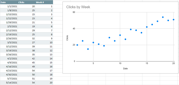
In this tutorial, we’ll start with a Scatterplot that is showing how many clicks a website gets per week.
As you can see, our date is on the X Axis and Clicks are on the Y Axis.

Changing your X Axis (Horizontal) Values
Let’s say to show a cleaner visual, we want to show the Week # instead of the date to show how it increases over the weeks.
We created another column to show what we want to replace the current X Axis with.

- Right click on the graph
- Click Select Data
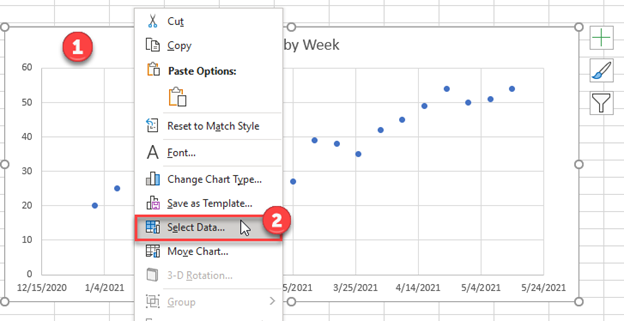
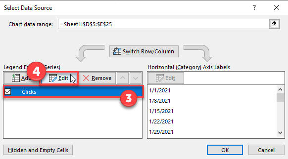
3. Click on your Series
4. Select Edit
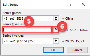
5. Delete the Formula in the box under the Series X Values.
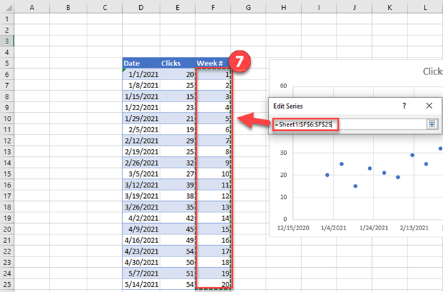
6. Click on the Arrow next to the Series X Values Box. This will allow you to select the new X Values Series on the Excel Sheet
7. Highlight the new Series that you would like for the X Values. Select Enter.
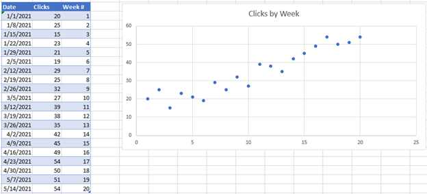
Final Graph with Updated X Value Series in Excel
Now you’ll see the new value shows the week number instead of the date.
How to Change Horizontal Axis Values in Google Sheets
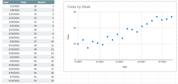
Starting with your Graph
Similar to what we did in Excel, we can do the same in Google Sheets. We’ll start with the date on the X Axis and show how to change those values.
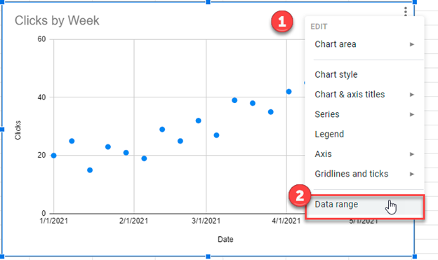
- Right click on the graph
- Select Data Range
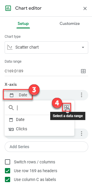
3. Click on the box under X-Axis
4. Click on the Box to Select a data range
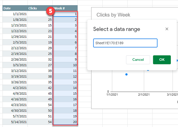
5. Highlight the new range that you would like for the X Axis Series. Click OK
Final Graph with Updated X Value Series in Google Sheets
